Site Manager

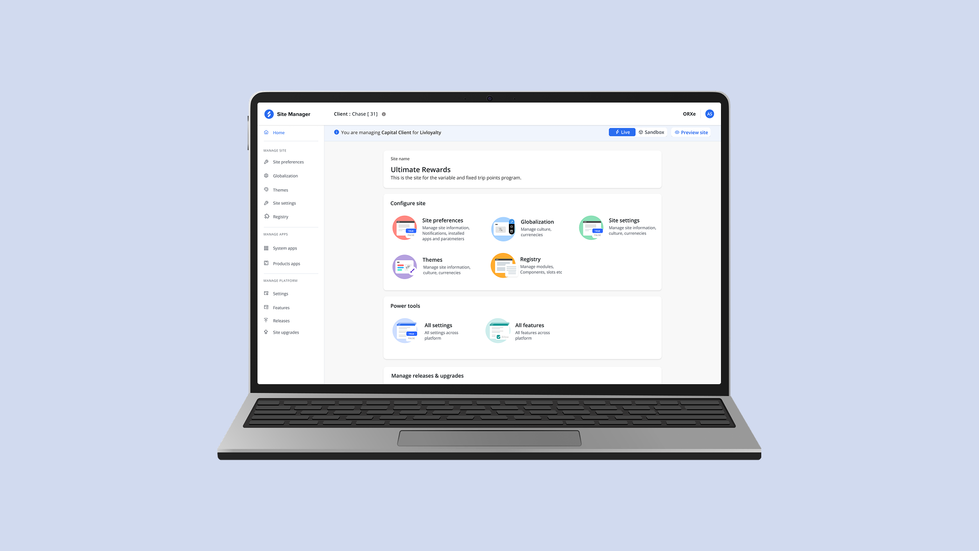
Project Overview Improving Ownership & Release Control with Module-based Registry Management Timeline: 6 Months Role: Lead Designer Team: 1 Designer, 1PMs, 1 Tech Lead About Site Manager Long story short I led the vision for a new way to help engineering teams manage shared registries with clarity and control. I partnered with Tech Architecture and Product to design a solution that reduces ownership confusion, improves traceability, and prevents uncontrolled deployments. Key accomplishments included: 01. Design Owned the design for a new “Module Release” feature that separates registries by app/module, enabling teams to release independently—with override support when needed. 02 Collaboration Collaborated regularly with Product and Tech to shape requirements, align stakeholders, and define sprint goals supporting the product roadmap. How might we help multiple teams use a shared registry with clear ownership, auditable change tracking, and controlled deployments? Speaking to users (SiteManager) I went out and interviewed 6 SiteManager users across multiple teams to understand what breaks when everyone ships through a shared registry. I spoke with engineers, release owners, and platform stakeholders to capture real workflows (not the documented ones). Across interviews, one theme was consistent: shared registry ownership is unclear, changes are hard to trace, and releases feel risky. Interview Questions:Walk me through how you publish a change to the registry in SiteManager. How do you know who owns a module or section of the registry? Where do you look to understand what changed and why? How do you test and release only your changes today? What happens when two teams make updates that conflict? Tell me about a recent incident caused by a shared registry update—how was it triaged and resolved? If you had full control over your module’s release process, what would “ideal” look like? Opportunities I guided my team to four main feature areas for the MVP Based on user research and recurring pain points, we focused the MVP on ownership clarity, traceability, and safe, independent releases. 01. Module-Based Registry (Segmentation) 02. Ownership & Access Controls 03. Audit Trail & Change Tracking 04. Release Controls (Module Release) User flow Defining the feature concept I brainstormed three key features to address the main pain points from research—clear ownership, change visibility, and controlled releases. 01. Module Widget (in-app) Teams can add multiple modules within an app, edit/delete modules, and view a change log to track updates over time. 02. Create Release Users can select components for a specific app/module and create a release—so teams can ship updates intentionally instead of bundling changes. 03. Module Release Page A dedicated page to manage module releases end-to-end: review changes, confirm ownership, and control when/what gets deployed. Final Design Key Takeaways Success Metrics (New Design) Metric Registry releases per month Conflict rate in registry releases Automated rollback in QA/Stage Before (Old Registry) 3 – 4 ~7 out of 10 Not available After (Module Release) 8 – 10 ~1–2 out of 10 100% rollback capability Qualitative Usability Test Metrics User satisfaction score Task completion rate Positive feedback 4/5 95% 8/10

Campaign Management

Hotel Content  Hotel Content is a central tool for managing hotel and room content. It pulls data from multiple suppliers and standardizes it (descriptions, photos, amenities, rates, and policies) so clients can update once and publish everywhere with consistent, accurate information. Campaign management case study Campaign management is the process of creating and managing campaigns, where each campaign groups properties into collections with defined benefits, so the right guest perks are applied consistently and can be tracked and controlled. 1. Campaign: A business initiative (like a promo) that defines a set of rules and benefits. 2. Collection: A group of properties inside a campaign that share the same rules/benefits. 3. Benefit: The guest perk offered (e.g., breakfast, credits, flexible check-in/out). Timeline: 6 Months Role: Lead Designer Team: 1 Designer, 2 PMs, 1 Tech Lead What’s really going wrong 1. Fragmented spreadsheets and tools cause confusion.2. Properties end up with conflicting benefit mappings.3. Simple changes require developers, slowing launches.4. Reporting and audit trails are unclear or missing. Teams affected 1. Business ops & supplier account teams2. Customer support3. Engineering4. Compliance/audit How we’ll fix it 1. Centralized platform to manage campaigns, collections, benefits, and property mappings.2. Automated validation to catch wrong properties, date issues, priority conflicts, and duplicates.3. Role-based governance with approvals.4. Reporting to filter, view, and export data. Designs How we designed it Primary research Primary research covered six user’s group. They need fast validation and bulk mapping, conflict checks and approvals, regional/brand filters and exports, audit trails, consistent reporting, and clear APIs with reconciliation details. 1. Understand why teams need a single place to set up and govern campaigns, collections, and benefits.2. Identify challenges in selecting properties, preventing duplicate mappings, and managing effective dates and priorities.3. Explore how teams currently add, track, and audit property mappings across fragmented tools.4. Determine key features they expect in a self-serve campaign management platform (validation, approvals, audit, reporting). Brainstorming Session 1 White-boarded with the Product Owner and Tech Lead to align on the problem, success criteria, and MVP; mapped the workflow and key user flows, and set guardrails.
 Outputs: pain points, shared vocabulary, draft data model, prioritized features, and next steps for prototyping/technical spikes. Session 2 Matched research findings to potential solutions to decide which ideas to keep. Wireframes I completed three iterations to finalize the user flow. Consolidated feedback (Iteration 1) Feedbacks received from from Product owner Created: A step-by-step flow to create campaigns, collections, and benefits individually. Improved: Enhanced the “Campaign Created” confirmation page to consolidate all campaigns and benefits in one place. Impact: improving visibility and reducing the need to navigate across multiple pages. Consolidated feedback (Iteration 2) Feedbacks received from from Tech partner & Product owner Created: A centralized landing page where users can view all campaigns and create/manage campaigns, benefits, and collections. Improved: Replaced the step-by-step flow with a single landing-page hub for campaigns, benefits, and collections. Impact: Making it faster and easier for users to find, create, and manage everything in one place. Consolidated feedback (Iteration 3) Feedbacks received from users and alignment with internal stakeholders Improved: Incorporated user feedback, aligned with internal stakeholders, and finalized a single Campaign Details page as the central place to manage a campaign after creation (add/edit/manage/delete). Impact: Consolidated campaign management into one page, reducing navigation and making ongoing updates faster and more intuitive. Usability Test (Task based assessments) Goals 1. Effectiveness — can users complete the task?2. Efficiency — how quickly do they complete the task?3. Satisfaction — how do they feel about it? Planning 1. Participants: focus group of 5 usersPlatform: 2. QA enviornment 3. Session: 60 minutes each, via Zoom (ID: XXXXXXXXXX)4. Team: 1 moderator, 1 observer Success metrix Task success: 86% (6/7 tasks completed) Time on task: Most tasks completed quickly; tasks 2 & 4 took longer due to confusion/errors Feedback: Listing page clear; search bar placement confusing; editing name/description easy but campaign key not editable; duplicate campaign name error frustrating Hi-Fi Mock-ups Impact 70% faster property onboarding (less dev dependency, safer bulk actions). 85% fewer duplicate/conflicting mappings (rules and pre-checks). Fewer guest issues and support tickets (clear, consistent benefits). Stronger compliance (approvals + full audit trail). Learning 1 I assumed too much … Users value features that solve their real problems, not just what we think is important. Learning 2 I expected too much… Some functions we thought would be popular—like bulk editing—were rarely used, while simple update tools got more attention. Learning 3 I engineered too much… Focusing on perfecting the interface before testing slowed progress. Early feedback and quick iterations worked better. Takeaways This project showed me the real impact of user research and user needs discovery. Instead of treating research as a checkbox, speaking with the ops team and business users gave me new perspectives, clarified user pain points, and helped me understand their day-to-day workflows and constraints. I learned that open conversations often surface deeper insights than formal interviews. By building trust and creating continuous feedback loops, I could validate assumptions, align on user goals, and keep designs grounded in real usage—while also mapping those needs to business goals like operational efficiency, consistency, and scalability. Hearing users say they would actually use the tool strengthened my confidence in the design direction and reinforced the value of a user-centered, centralized platform that improves discoverability, reduces time-on-task, and supports faster, more accurate campaign management.

Hello world!

Welcome to WordPress. This is your first post. Edit or delete it, then start writing!